@[email protected] to [email protected]English • 1 year agoxkcd #2912: Cursive Lettersimgs.xkcd.comimagemessage-square210fedilinkarrow-up1827arrow-down118file-text
arrow-up1809arrow-down1imagexkcd #2912: Cursive Lettersimgs.xkcd.com@[email protected] to [email protected]English • 1 year agomessage-square210fedilinkfile-text
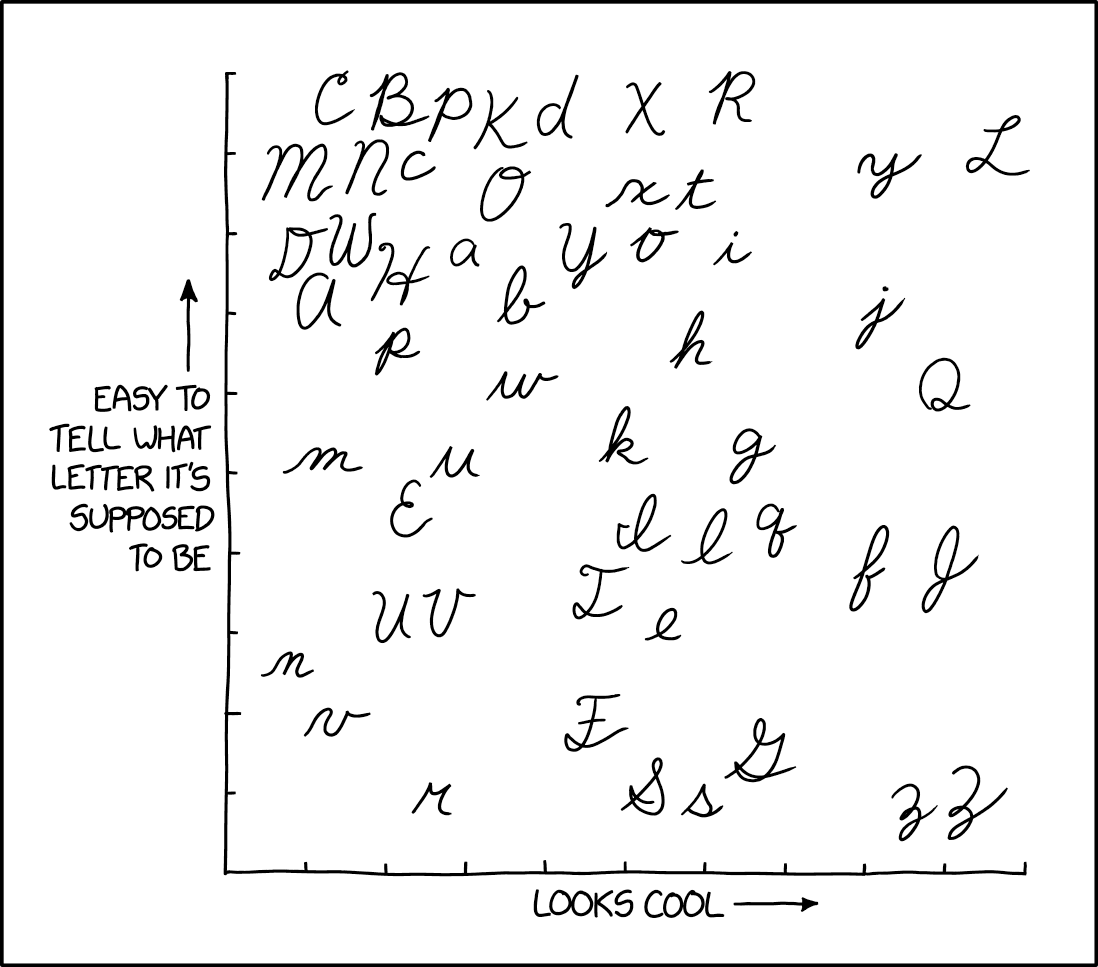
https://xkcd.com/2912 Alt text: 𝓘 𝓽𝓱𝓲𝓷𝓴 𝓬𝓪𝓹𝓲𝓽𝓪𝓵 𝓛 𝓲𝓼 𝓹𝓻𝓸𝓫𝓪𝓫𝓵𝔂 𝓽𝓱𝓮 𝓶𝓸𝓼𝓽 𝓯𝓾𝓷 𝓽𝓸 𝔀𝓻𝓲𝓽𝓮, 𝓽𝓱𝓸𝓾𝓰𝓱 𝓵𝓸𝔀𝓮𝓻𝓬𝓪𝓼𝓮 𝓺 𝓲𝓼 𝓪𝓵𝓼𝓸 𝓪 𝓼𝓽𝓻𝓸𝓷𝓰 𝓬𝓸𝓷𝓽𝓮𝓷𝓭𝓮𝓻.
minus-square@[email protected]linkfedilinkEnglish4•1 year agothis feels like a shitpost and i wont fully believe it until - i dunno when.
minus-square@[email protected]linkfedilinkEnglish8•1 year agoNo, that’s true. However, putting lines under e.g. the ш makes it a bit more readable.
this feels like a shitpost and i wont fully believe it until - i dunno when.
No, that’s true. However, putting lines under e.g. the ш makes it a bit more readable.