

I hate these rebranding wanks companies love to do.
Think of all the money that was wasted on this for no reason at all.
And they just laid off a shitload of people too, didn’t they?
To hire more AI people, of all things.
And all of that for the radical idea of writing “Mozilla” in some font that seems cool at the moment.
I can’t help but feel like this is another bad omen.
I always assume rebrands are attempts to cover up something.
Unless they coincide with an entire board of directors change, it’s bullshit.
Right. It’s just a money wasting wank.
I love reading how companies justify their expensive rebrands.
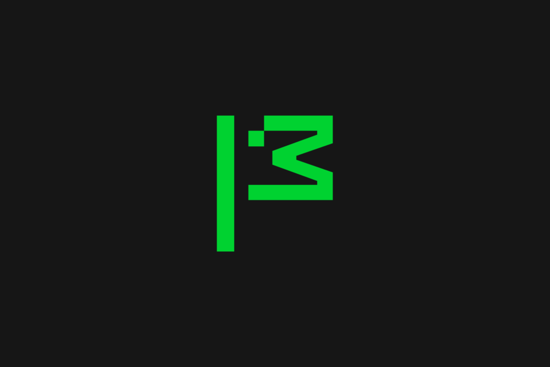
The flag symbol highlights our activist spirit, signifying a commitment to ‘Reclaim the Internet.’ A symbol of belief, peace, unity, pride, celebration and team spirit—built from the ‘M’ for Mozilla and a pixel that is conveniently displaced to reveal a wink to its iconic Tyrannosaurus rex symbol designed by Shepard Fairey. The flag can transform into a more literal interpretation as its new mascot in ASCII art style, and serve as a rallying cry for our cause.
Fuck off. This was designed by the intern the night before submission. It’s a fucking ascii dinosaur. The green doesn’t represent nature, it’s giving old monochrome monitor vibes, which doesn’t really scream “futuristic”. I’ve submitted enough bullshit design projects to know one when I see one.
You’re saying half-baked monochrome pixel art doesn’t come across as futuristic to you? Crazy!
To me it just reminds me of assets from the Dino game in Chrome. Good going, Mozilla.
This was designed by the intern the night before submission.
YFW you realise this was designed by a well payed marketing and digital design team that make more money in three months than you make in a year, publishes straight to production, regularly bypasses the VPN for work, and still doesn’t know how how to use the Oxford comma!
Wtf… mozilla had like the coolest logo among current companies and they just decide to replace with… whatever this is 😶
They’re waving the white flag 🤦
Which coolest logo? The Dino head or the moz://a?
That second one was clever
For me it was mostly the moz://a
That’s ugly as fuck. I’m a Mozilla fan all the way, but what the fuck guys??
I don’t get why they’ve started behaving do corporate recently
can’t say I’m convinced of anything by a logo change…
Removed by mod
Great use of donations.
Don’t remember this one on their questionnaire!
They changed their logo into… a stick figure chicken head.
That’s certainly something they did.
Green on black though. Like a terminal. For hackers! Bet you feel dumb now.
Hey, remember when the old Mozilla ‘throbber’ icon had a godzilla breathing fire on the planet or something?
Hey, remember when Mozilla made mozilla the app?
Hey, remember the time before SeaMonkey needed to be supported by volunteers because paid staff couldn’t do it for #reasons unrelated to being bored and sad at actual software maintenance?
Good times. GO BACK TO THAT.
Is that a duck?
The flag of Nepal.
I was thinking chicken.
Well, I guess I’m in the minority around here but I kinda like it. The animated dinosaur is a nice touch and the logo looks really good on the employee badges.
Same! I dig the dinoflag. Tempted to grab a sticker for my laptop.
At first I took a few glances, agreed it was bad, and contributed my own snark to the comment chain without reading hardly anything, as is tradition.
Couple comments like yours made me actually read the article and look closer, and I’m sold, at least provisionally. If “take back the Internet” is sincere, we need a lot more of that energy, would love for it to catch on.
If it’s “line go up” style nonsense a la blowing money on appearances while neglecting substance, then I guess it’ll feel as cheap as it first looked lol
Is this a bad sign or omen ?
I guess you could read it as an indication of commitment to their change of direction. And their new direction sucks.
So yeah, I don’t read it as a good sign.
I would love to love Mozilla. I still like Firefox. But it seems everything they are doing is the opposite of what I would have wanted them to.
Haven’t been keeping up, like what? Do you read this as just classic soulless marketing? Or is that too far?
For me, their commitment to hire people working on generative AI while dropping a bunch of smaller projects is the biggest red flag.
A lot of users are also upset about their efforts to create privacy respecting ads. The counterargument being that we don’t want ads at all.
They seem to be making increasingly corporate decisions, or at least that’s the fear of critics. Some people previously close to the organization has spoken out against it.
I’m sure there are a lot of people on here better suited than me at giving a summary.
Mozilla isn’t just another tech company
-> proceeds to act like any other tech company
We teamed up with global branding powerhouse Jones Knowles Ritchie (JKR) to revamp our brand and revitalize our intentions across our entire ecosystem. At the heart of this transformation is making sure people know Mozilla for its broader impact, as well as Firefox.
Sure sounds like they’re trying hard to make sure everybody knows how great they are. I still want to believe they won’t abandon the mission, but I’m losing hope.
I don’t hate the new logo, but I would have preferred they kept the italic l’s
those were slashes
Yeah. You can even visit moz://a in Firefox.
Same
Didn’t they just get a new logo last year or so?
Well, it may be stale by now.