

Memo from Marco Rubio reportedly said cutting Calibri from official communication would ‘abolish yet another wasteful DEIA program
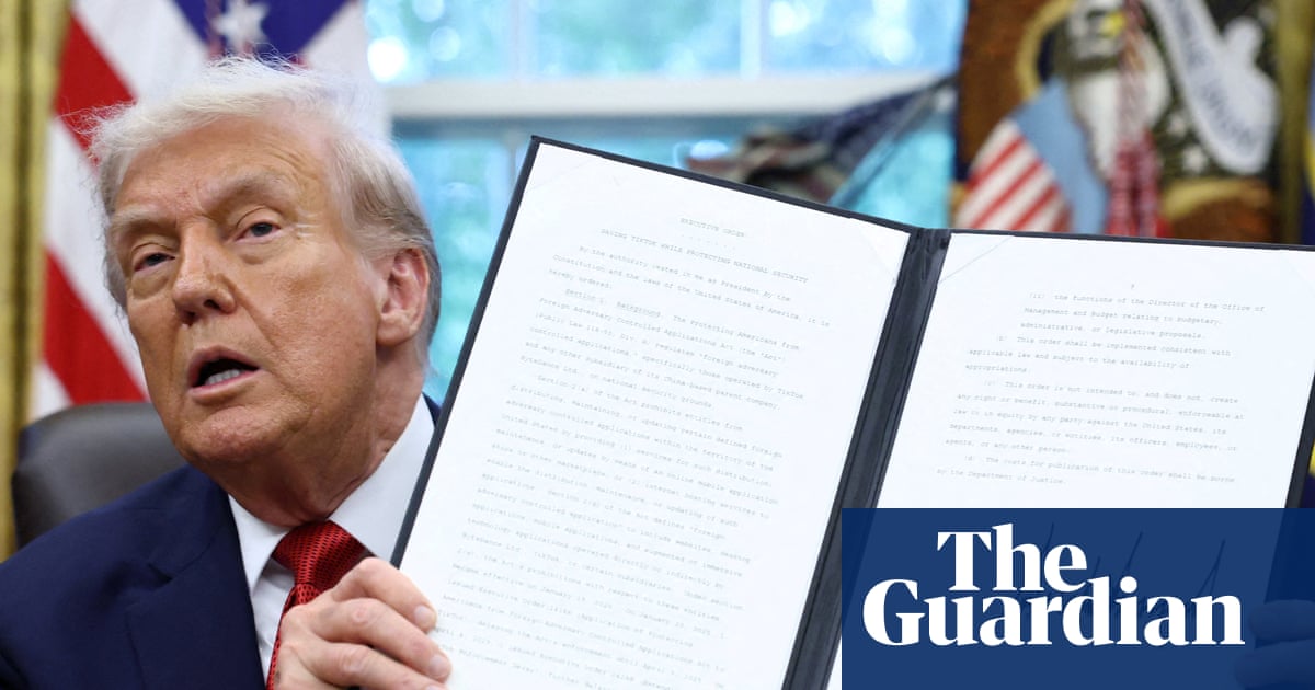
US diplomats have been ordered to return to using the Times New Roman typeface in official communications, with secretary of state Marco Rubio calling the Biden administration’s decision to adopt Calibri a “wasteful” diversity move, according to an internal department cable seen by Reuters.
The department under Rubio’s predecessor Antony Blinken switched to Calibri in 2023, claiming the modern sans-serif typeface was more accessible for people with disabilities because it did not have the decorative angular features and was the default in Microsoft products.
look i know literally everyone says this and it’s overdone by this point, but it’s true: we are in the onion timeline
How is using the default font wasteful? Apart from anything else I’m pretty sure it uses less ink.
You’re looking for reason? In this administration?
You should be looking for motive instead. Handicaps are now a kind of diversity. ICE will get right on it.
Literally anything to avoid doing actual work.
Republicans are like the one asshole in the group project that shows up with some stale donuts once and thinks they’ve fulfilled their end of the group project responsibilities.
So true lol. They are the type of teammate who only shows up 20% of the time, works on one tiny piece of the project with lots of help from other members, then claims they did all the work or blames everyone else when the project doesn’t get finished on time.
The experts and my own eyeballs agree that Calibri is slightly easier to read than Times New Roman, and it’s an improvement in legibility that means a lot to people with poor eyesight. But Republicans don’t give a shit about people with vision issues, probably think they should pull their eyes up by their bootstraps, so Times New Roman it is.
Shout out to all the people who don’t know what font they are using!
We use fonts? 🙈
I think they should have been changed straight out to comic sans.
Or Papyrus!
What in the goddamn actual fuck?
Now that we’re on this topic, Aptos sucks
But I think it’s still better than Calibri.
Why can’t they just use Helvetica like any normal bureaucratic institution?
Because the Swiss are foreign
Actually, it’s a little surprising now that I think of it that the US government never designed its own official font. That’s exactly the sort of weird shit any administration might try
Yeah, even Italy designed their official font. It’s called Titillium.
Instinctively I feel like doing that is a bad idea, since it makes it easier for scammers to create documents that have the feel of authority when trying to con people.
OK, now is the time to finally win the vi/Emacs war. We just need to convince the GOP that Emacs was designed to help a disadvantaged population compete in the workforce, and we’re on the way to banning it! This will be my greatest success.
San serif fonts are my jam. Screw TNR for regular use. Serif fonts have their place when you’re trying to give a document a certain feel, but nothing beats Arial or Calibri for regular reading for me.
Not just any sans serif.
Grotesques is where it’s at.
Maybe some geometrics for variety, or neo-grotesques if you need something simple and boring.
Those look right up my alley. Thanks!
scans wikipedia article
Hell, yeah! Helvetica!
I don’t know if this is a hot take but I always hated Calibri
I don’t think I would have disliked it if it weren’t the default font in Microsoft Office.
Is this rage bait? Feels like rage bait.
It’s more stupid shit to flood the zone.
deleted by creator
Performative cruelty. So hot right now.