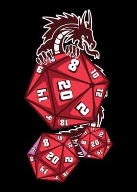
I wanted to try inverse clouds with black instead of white. It really muted the blue color and darkened them more than I expected. I don’t think they look bad but I’m kinda surprised at how much attention they are getting from people I show them to.
Constellation dice, nice
Those do look rad, but I think filling the digits in white would help them be easier to read.
Not necessarily white, maybe something closer to 50–70% darkness,. So, subtle but still plenty of pop. And I agree, they look great! I think because they’re simply very unique/individual, I haven’t seen something too similar to these before so they’re immediately cool.
I’m planning to do a blue to accentuate the color, lighter than the base so it’s readable but not bright enough to take away the darkness.
Oh I expected gold for the numbers
I don’t like using gold because it becomes a habit. Gold goes well on most things so it ends up being the main color used once you start using it. I’m trying to use more color theory with my numbers.
As did I.
They do look cool.
I have made many dice that didn’t turn out how I wanted but friends raved about. It sounds like you have some prime gifting targets for this set.
Thanks to the facets, dice can be visually “tinted” by the smallest amounts of color. It is way too easy to muddy colors together. Possibly adding some foil glitter to the translucent resin to better define its area?
Those are utter garbage. Let me help you get rid of those
marvhorrible rocks.If it’s easier you can send them to me. You should get those void-engulfing cosmic mystery dice away from you as soon as possible.
I have a set of pastel cloud dice in the pressure pot now to make up for how dark these turned out. They will probably be too bright 🤣.
The moral of the story is that while I can’t ever make myself happy I can at least please others.
I have a little skull mold I use for dumps and this is what it looked like before going in the pot

Inked.

deleted by creator
The numbers haven’t been inked yet.
I haven’t done the numbers yet.
